



The Cormorant
Branding, LogosThe Cormorant
Type & click enter
Categories
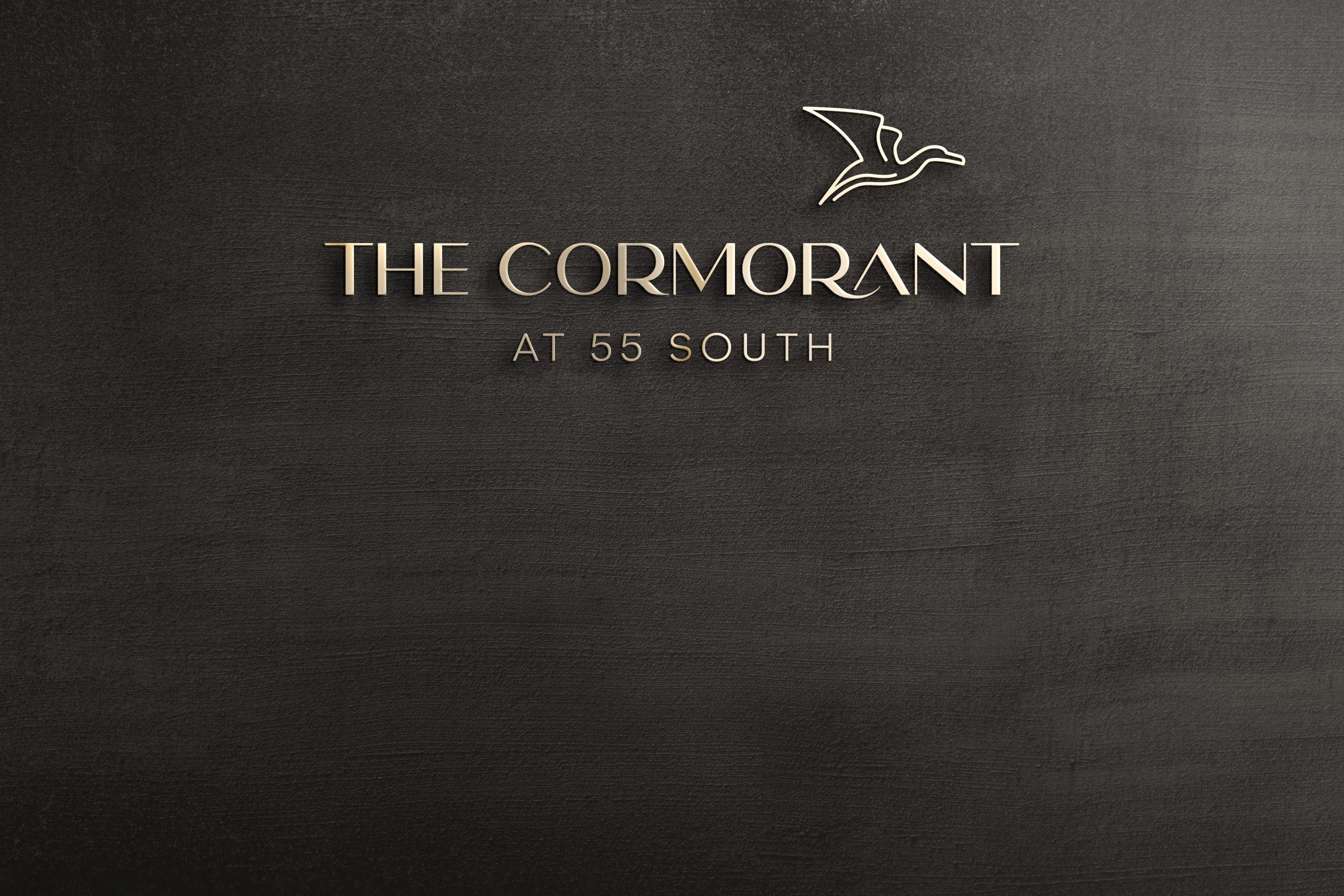
Puerto Williams is the southernmost town in the world, on Navarino Island along the Beagle Channel. The Cormorant at 55 South needed an identity that could carry that sense of remoteness without feeling cold or rustic. The brand had to feel like a discovery: refined, grounded and unmistakably tied to the place.
The Idea: Land, Peak, Water
The identity rests on three elements of the Patagonian landscape: forest, mountain and sea. Every decision in the system traces back to one of them.
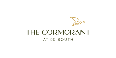
The cormorant is the heart of the identity. It is a native seabird that lives between shoreline and sky, and it makes a fitting emblem for a hotel at the edge of the continent. We drew it as a single continuous gold line, a gesture rather than an illustration. The wing sweeps back like a ridgeline, and the neck curves in one confident stroke. Its lightness gives the wordmark a point of lift and balances the weight of the typography below.
The mark sits high and to the right of the wordmark, as if the bird has just left the lettering and is moving out toward the channel.

The colors come directly from the terrain and are meant to feel natural and timeless.
- Deep Forest Green: the primary brand color, grounding and calm, evoking subantarctic woodland.
- Metallic Gold: reserved for the cormorant, like light on water at dusk. Using it only for the bird makes the mark the focal point.
- Supporting earth tones: warm browns and soft beige for backgrounds, materials and print. They bring warmth and a tactile, natural quality to the system.
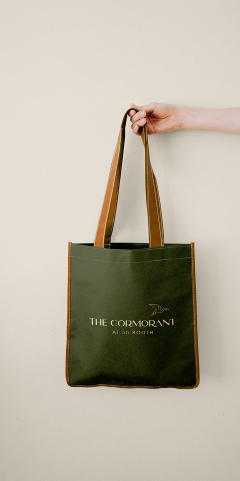
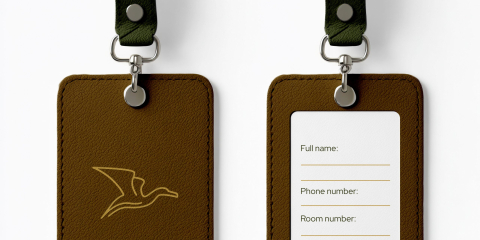
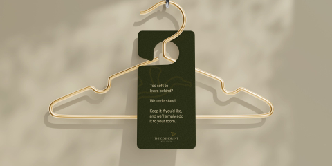
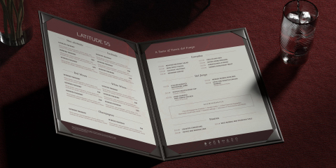
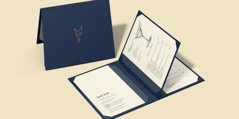
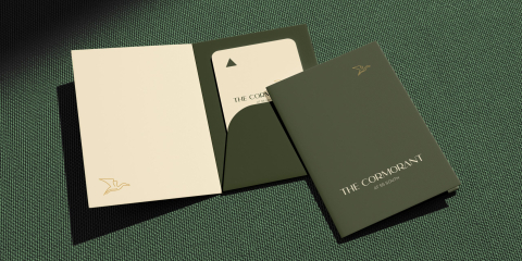

The identity feels both rooted and airborne: weighty, grounded type paired with a delicate, soaring mark. It is restrained enough for luxury hospitality and distinctive enough to belong to this place and no other. It works across signage, key cards, stationery and textiles, and the gold bird can stand alone as a quiet seal wherever the full lockup isn’t needed.
Thank you
Leo Cepeda
